Showing posts with label collectibles. Show all posts

Saturday, October 18, 2014

Real Photo Postcards

I found this gem of a postcard at a shop in Newport today. Collecting postcards is fun, because for a buck you can add something nice to your collection and feel like you've gotten yourself a treasure.
I quickly flipped through sixty or seventy cards, and nothing was grabbing me when suddenly I saw this one. I felt something like heartache as I looked at it.

This is from the collection Paris...En Flanant, which translated means Paris... Sauntering. Nice, huh? It is by Editions d'Art Yvon, who produced cards between the two World Wars, from 1919 - 1938. This card was not mailed so I don't have a postmark to indicate when it was taken, but I imagine it is the 1930's.

On the back of the photo paper is printed "L'ancetre des Bouquinistes quai de la Tournelle". The best I can do with online translation is the ancestor (old man?) of the dock of booksellers at Pont de la Tournelle -- a bridge over the Siene.

This is an example of what is called a Real Photo postcard. Since you are looking at it on a pixelated screen it will be more difficult to discern, but it looks and feels like a photograph and was actually developed onto a photographic paper with the weight of a postcard.

Real Photo postcards (RPPC, if you are searching them on eBay) were done by large houses, like the Paris one, and also by individual photographers who could print several or even just one photo for a person on a postcard backing. The backing might simply say POST CARD, with a divided back for a message and an address, so you may not find anything identifying who or where or when the card was taken. Here is an example on one of this type that came in my assorted box-o-postcards. I wonder who they are, and what was special about this day. It was not mailed, so I don't have a story to go with it. I'm also not an expert on wardrobe, but this looks like 1920's to me. Feel free to make up your own story for it. Don't forget to include the dog.

RPPC are not to be confused with printed black-and-white postcards, Here is one of Rehoboth Beach, Delaware that is not a real photograph, though it looks very much like one. It is a mass reprint of a photograph, printed using a process called collotype. It was made by The Mayrose Company in New Jersey, who printed cards from 1940 - 1950. If you looked at it magnified, you would be able to see ink dots, which are found on any card that is mechanically printed rather than developed.

Now, when you see old postcards, you can enjoy knowing the difference!

Saturday, October 11, 2014

Postcards from 1906 - The undivided back


"My little pet, I hope you are well and enjoying yourself...."
Writings were not permitted on the address side of postcards in the US until March 1, 1907. Postcards were sent for their lovely images, with a few words jotted where they'd fit, or a rambling note scrawled in the margins. This sweet little card is titled The Critic. It's pretty damaged but the colors are rich and the artwork is well done.

You can identify these very early postcards by looking at the reverse side, where you'll find the undivided back and instructions that 'This side for the address only'. Harken back to a time when a letter could get to a person with just their name and city. Maybe in small towns it would still work today, where you have a postmaster and a really small population, most of whom get together for coffee at the local hotel of a morning -- but you'd do better to have a zip code to help the robots route the card to the right city. And then most of us would need a full street address because the people who sort and deliver mail don't know us from Adam nor Miss Evangeline Dreher.


Printed up the edge on the left side of the address it says 'Compliments of Hearst's Sunday Boston American', so I'm guessing the postcard came with the Sunday paper 108 years ago this week, as the card is postmarked Oct 8, 1906. Like us, they were facing the reality that winter was coming, thinking about the forecast, and also enjoying a little joke about the challenges of love: WEATHER REPORTS - COLD AND FROSTY. Clever, huh? It's a cute card. The message is in code from whomever mailed this to Miss Evangeline Dreher and we can only wonder if she got the intended message: F.B.M.P.C.D.C.H.S.M.E.B. Whatever could this mean? If it said ROFLMAO, or OMG LOL, we'd get it. Any guesses? I'm sure we could have fun suggesting possible tidings, and from whom.
These were called 'penny postcards' because they cost one cent to mail. Though if you needed to forward it because you didn't even know what city a person lived in (you couldn't just check facebook to keep track of friends and family), it looks like a second stamp was required.


Here is a lovely picture from the Maine seaside near Portland -- Ponce Landing, Long Island. The entire message is written in the sand, "Letter coming, Harry." I don't feel like writing but I'm alive. Here, enjoy this picture of the sea. Very nice, Harry. A text, or a tweet. Thank you. What in the heck have you been up to? That beach had room for a little more information, son! Then there is sky-writing, look at all that sky! But the picture is very nice, the sand writing is perfect, and the whole scene makes me smile.


This one is nice, from Broadway Central Hotel in New York. The message is a poignant, "Oh! Memory paint this scene again. L.J.D."

It would make a good writing prompt. We'll never know what stories unfolded at that place and time, but it's fun to consider. Those secrets still drift in the ether from 1906, alighting occasionally on the shoulder of a passerby to offer a fleeting contented feeling of deja vu on Broadway, Corner Third Street.


Monday, October 6, 2014

Postcards From the Past

Lately I've become somewhat enamored of old postcards. My favorites are the linen cards from the 1930's and 1940's, and the older cards with black and white photographs or gaily drawn picture greetings for every holiday. There are cards with flowers, birds, Santa, angels, chicks and witches. Then there are the cities, seasides, diners, waterfalls, people, gardens, ships and bridges.

Some collectors may like the more pristine cards, but I'm sympathetic with them showing some wear. Nobody's perfect. I'm more excited to find the ones that are pretty and also used, posted to somebody with a message. Somebody took the time to send somebody some words 70 to 100 years ago. These writers are likely gone from this Earth by now, and yet something they hollered across the miles to a loved one sits waiting like a wallflower to dance into someone's heart again. I'll read you, little postcards.

So that explains my recent eBay purchase of 200 slightly damaged vintage postcards, cheap. I'm excited to get them and start to sort through my treasure. I think I'll make them a periodic feature on the blog. Postcards from the past.

Thursday, September 25, 2014

A Jolly Good Find!

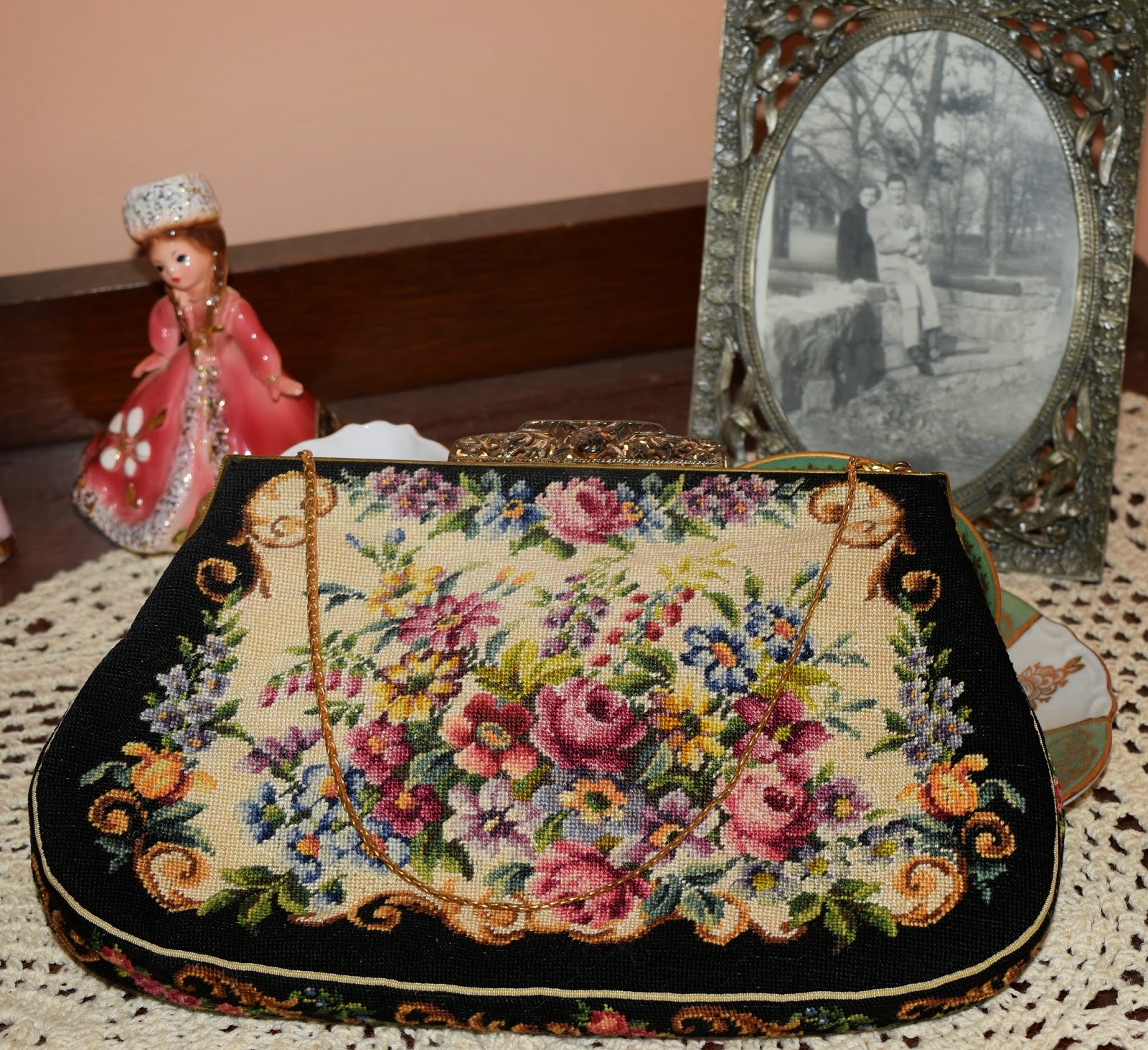
I found the most delightful purse at the Goodwill last weekend. Jammed into a cluttered bin with assorted brown vinyl wallets, damaged clutches and stained makeup bags waited this gorgeous hand stitched silk petit point purse. I picked it up and could not put it back down! This needlework is so fine it is almost unbelievable that somebody did this by hand. The best I can count with my failing eyesight, there are at least 32 stitches per linear inch -- that's over a thousand stitches per square inch. Remarkable! The design is on both back and front, and also all around the side panel. There is silk piping around the edges. I can't find any stains, inside or out. It is like it was never used. The feel is luxurious. The thrift store price? Four dollars.


The brand is Jolles Originals, made in Austria. I looked up the brand, and was happy to find a new website proclaiming:
 "Simple, quiet elegance. This was the message my great grandmother, Ida Jolles, communicated when she founded Jolles Original in 1923 Vienna. Her handbags reflected her life. She embodied beauty, brilliance, and strength; her products communicated refinement and sophistication. In 2014, inspired by her life and message, we are relaunching my great grandmother’s company. Jolles Original was a luxury brand in the mid twentieth century. Her purses sold in high end stores, and are collectors’ items today."  


I don't know whether to keep it or to sell it. There are avid purse collectors who would enjoy having it in their collection, I'm sure. And I don't know if I'd want to use it and put anything inside this pristine lining. The only indication I see that anybody ever had it open is that there are some pinholes in the silk lining, as if somebody had pinned a few brooches inside for safekeeping.

There is a book in the works with the story of Ida Jolles, and I'm going to keep an eye out for it. I would be interested to read how she defied convention to build this company.

In just a few years, Ida Jolles had created a needlepoint production system that extended throughout Austria, eventually employing over 20,000 craftswomen. This was an astonishingly early example of what business leaders would now call “a distributed and flexible workforce”.
By the late 1930s, Jolles Original products dominated many fashion and home furnishing categories. International distribution was key to the business’ strategy and success, and Ida Jolles was the driving force behind it all.
In the United States, the Jolles brand was carried by the most elegant department stores and boutiques, including Bergdorf Goodman, Saks Fifth Avenue, Bloomingdales, Macy's, Marshall Fields, and more. 
I'd love to know what year my purse is from. Somewhere in the 1930's to 1950's range, I think. Here is an enlargement of the needlework so you can see the detail. The colors are intense, with subtle shading. To keep, or to sell. What would you do?

Oh, and keep an eye out for Jolles Originals as a newly launched brand in 2014!